
For instance, in a recent comment, a supercool reader pointed me to Ain't it Cool News, where there's a comparison of the posters for both the original Black Christmas and the upcoming remake. I've brought the images home to roost for discussion, thanks to the power of The Internet. Let us begin with the poster for the original movie, this one in particular is sporting one of the film's alternate titles:
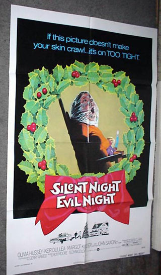 OK, alright. Nothing terribly spectacular, but nothing terribly awful, either. The corpse with a bag is probably the most enduring image from the film, so it's fitting to use it here. I like the tagline...it's so so 70s, when, instead of trying to be a cool catchphrase, taglines tried to convince you that films were shocking and terrifying (see also: Last House on the Left, The Texas Chainsaw Massacre). Nowadays there's no real pizzazz, you know? It's like..."Evil has a new face!", which just makes me think, "Well, good for evil! How nice."
Now then, on to the poster for the remake. Before I put it up here, let me just say that I have Flintstones Chewable Dial-Up Internet Service here. Yes, I know...how very 20th century of me. The reason this matters is, I read the copy on Ain't It Cool before the image loaded and I was led to believe by the praise therein that the poster would be...well...not what I think...anyway, look at it, will you?
 What. The fuck. IS THAT? I'm not just being prejudicial against the remake, I swear. I have the highest hopes for every single horror movie that emerges on screens both large and small, honestly, no matter what. But that, my friends...that poster is a piece of brightly colored crap. I really hate to get my nerd on like this, but that fucking font used on the tagline drives me nuts. Who decided to use some fucking KidPrintScriptBullShit facsimile from Microsoft Fucking Word on a horror movie poster? I see no reason to ever use such a whimsical font, least of all on a horror movie poster.
Now then, the image itself. Is that a dead person? Is that someone hiding from someone else, being scared? Is someone waiting under the fucking fiber optics to see if Santa will really come to snack on the cookies and milk? I have no idea. It's pretty damn reminiscent of the poster for the remake of The Hills Have Eyes, an image which I also thought was terrible. It could have maybe been ok, but the girl pinned down looks decidedly unterrified. Maybe they're just reusing the same bland girl head over and over again with different toppings for different movies. Now it's a hand! Now it's fiber optics! Use it again for the Halloween remake, but be sure to use a pumpkin!
Is the remake officially being called "Black Xmas"? I guess that red "x" means something bad will happen during the movie, but frankly it just makes me assume I should watch the movie whilst drinking a Mountain Dew and doing a goofy foot ollie kickflip on my board. How hip!
Ah, Mondays.
14 comments:
Black Xmas? I guess the X means this movie will take it to the EXTREME!
I think they're using the "X" to remind potential viewers of porn. See, the slimey producers are lucky that the "X" can work both ways for them..."it's not just porn, it's Christmas, too." Wheee!
Personally, I like the image on the poster. I think the girl depicted has been killed and wrapped in Christmas tree lights. (In the past, I've actually felt this way after decorating a large tree.) I too think the font blows, but I like the way the pretty colors look on her dead face...bwa ha ha ha!!!
Hey I'm that supercool reader and thanks for the props and your comments are about what I expected from this monstrosity of a one-sheet. Do you think the 'X-mas' was added to to appeal to the younger crowd or to stay away from affiliating itself with any religion whatsoever for maximum mass appeal, at least in it's advertising? I'm guessing both. Happy Holidays indeed.
88ArterialSprays
Bah-Humbug!
Is it really worth getting huffy over?
TO THE EXTREEEEEEME! Not unlike BOLD Doritos.
Theron- I think you're right that it's supposed to be someone dead wrapped up in lights...it's just so benign looking, I think the image could have been punched up a little.
Err, dusk...lighten up, dude. Is it worth getting 'huffy' over? I'm just fucking around here, you know? I can't say that ANY movie poster design, good or bad, has any direct bearing on my life. Someone pointed me to the link (thanks, 88!) and wondered what I thought. I posted what I thought with some...dramatic enhancements. Am I really huffy? Well, no, though I stand by my opinion. Would this have been a better post if I simply put up the two posters and talked about the differences sans swearing? Maybe, but that's not how my instincts are sometimes. This was meant to be fun. If you've read Final Girl, you may have picked up that I like to play the cranky card at times, usually over the small things. I like to do it. I'm really into righteous indignation over minutiae (and the bigger picture, even), especially when I'm completely wrong.
And what's even worth posting about, huffy or not? It's all just entertainment.
I love John (in a hetero way), "getting huffy."
I wasn't as disturbed at the poster as I was over everything else having to do with the remake.
At this point, where current horror fans have their horror spoon-fed to them & everything is a fucking committee meeting or focus group, I thought this one went against the grain a bit.
It wasn't all Brokeback Chainsaw Massacre like the poster of the ill-conceived prequel, it reminded me a bit of a pre-cert video box. I dunno, I'm still just completely offended by the actual remake.
Final Girl & Retro-slashers, be friends. Or I'll take your sit & spins away!
p.s. John, aren't you the guy who "got huffy" over the incorrect teeth on the "Visiting Hours" box?
Heh...are you kidding? Mr Retro is my hero.
"Horror by committee"...you're exactly right. Commitees ain't good for nothin'! Nothin', I tells ya!
And RE: this remake...at the risk of sounding like Han Solo, I have a bad feeling about this, indeed.
It's like..."Evil has a new face!"
Evil special guest-stars on Nip/Tuck!
The first poster would have scared the crap out of a little old me back in the day. The thought of suffocating is just traumatic. The second poster just looks corny for lack of a better term. The tag is boring and rote and pretty unimaginative, but I bet some yahoo is pretty proud of her/himself for coming up with that.
As for the "X-mas," with so many people getting up in arms any time something Christian or Christmas-y is associated with something bad, maybe they decided to play it safe so they won't have Pat Robertson and his ilk on their backs.
I like the Hills have Eyes poster. To me it's like she snapped and checked out completely. She's just gone, passed being scared. Also, I would like the new Black X-Mas poster if it was just the picture. I agree the tag-line and font suck.
I gotta agree with you, Stacie. I miss posters that are drawn. It seems to me that posters are meant to stand out, to grab people's attention. Seems to me that the original Black Christmas poster would do just that.
But then... when we're talking about a movie that a) probably will bear little resemblance to the original and b) most likely won't be anything to write home about, this poster is fitting.
Hmph...
First, I wasn't too upset by the poster, which is strange because sometimes I get all bent out of shape about the stupidest things and my poor wife ("Can't we just have a nice drive?") has to bear with all my hyper drivel ("minutiae" is a TERRIFIC word, by the way, and it may have been the exact word I was trying to think of the other day... all I came up with was "trivial" and "little tiny things" -- hey, what do you expect when you consult a lame-asaurus? So 5 peanut butter/chocolate eyeballs for you!)
(Uh... I don't really have a reservoir of fictional points to offer, but I have tons of imaginary Halloween candy...)
But the tagline's font IS curious; for some reason, tho' it didn't get under my skin, just made me puzzled.
But the BLACK X-MAS is interesting.
This poster totally appeals to a new crowd, I think.
I don't think they really are looking to fans of the original.
Although the PC choice of going "X-MAS" vs. "CHRISTMAS" makes a lot of sense, and probably IS the main rationale for going that direction,
the "X" allowed for a "cool" red, slashy X there. It's "cutting edge!" But it also separates itself from the original moreso. I'm wondering if that's intentional or just me.
You should check out the really original artwork for The Hills Have Eyes 2!
http://chadwickhsaxelid.typepad.com/chadwick_h_saxelids_cluel/2006/11/behold_the_wond.html
Wow.
Post a Comment